Casabianca Cycling
Four years designing and optimizing a cycling apparel brand's Shopify store.
As Casabianca's ongoing eCommerce designer, I designed and continuously optimized their Shopify storefront, product pages, campaigns and brand system from 2018 to 2022.

The problem
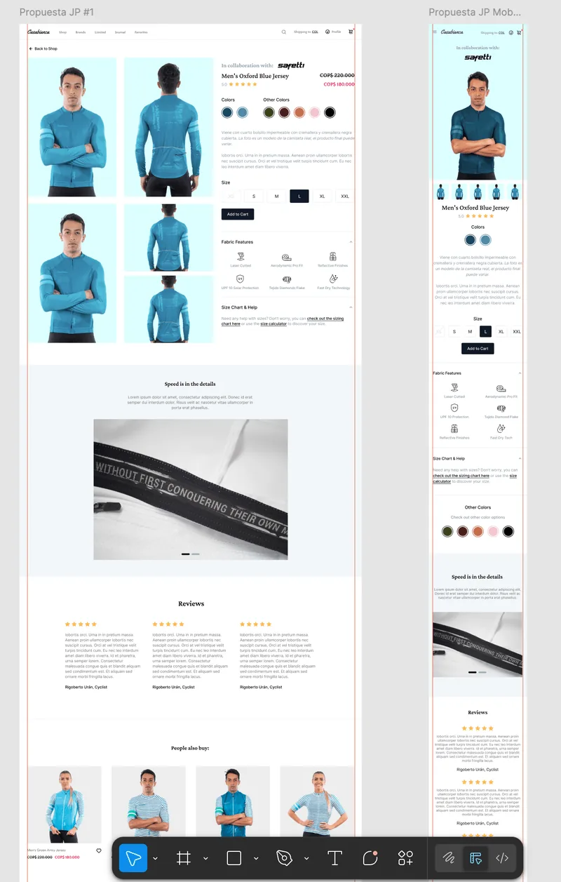
The Shopify store's shopping flow had visual clutter, weak purchase hierarchy and checkout friction that made the brand feel less trustworthy than the product.
My process
- Owned the Shopify store end to end: customised the theme in the theme editor, built reusable sections, and designed the product-page, collection, home and landing templates - continuously optimised over four years.
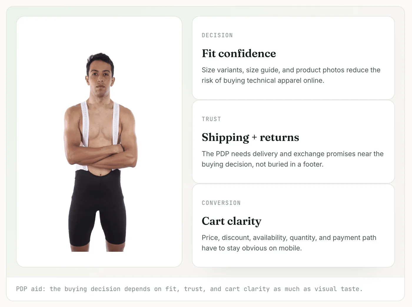
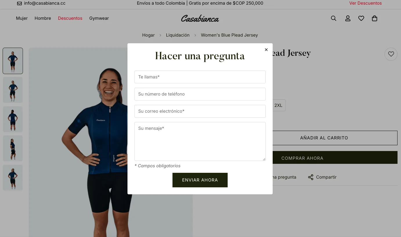
- Improved product-page hierarchy, variant and size selectors, and the path to Shopify checkout, applying conversion-focused principles to cut friction and make the buying decision easier.
- Delivered Liquid-aware, section-based specs the theme could drop straight in, and used Shopify apps only where they earned their place - keeping the store fast and easy to update.
- Kept one visual system across the Shopify store, campaigns and physical touchpoints, and extended it into social content, packaging and apparel product design.
The solution
A calmer, continuously refined Shopify store - stronger product storytelling, cleaner CTAs, a smoother path to checkout and a reusable, section-based theme - kept consistent and on-brand across years of launches.
Impact
A calmer, more premium storefront that stayed consistent and on-brand across four years of product launches and campaigns.
Marketing & visual design
Beyond the store.
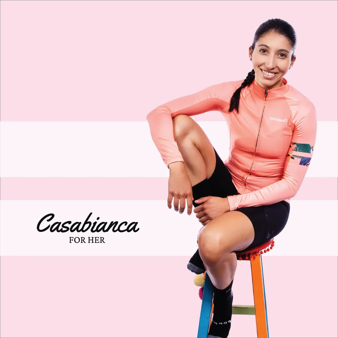
Beyond the storefront, I ran Casabianca's visual and social presence - turning a technical apparel catalog into content people wanted to share. Every drop, sale and collaboration had to feel as premium as the product and stay unmistakably on-brand across dozens of touchpoints.
Each colourway got its own identity - shot on-model with its named colour and Pantone reference (Oxford Blue, Morocco Orange, Olive Green) so the catalogue read as a considered collection, not a list.
Reusable social templates and a shared storefront-to-Instagram visual language kept launches, sales and Black Friday on-brand at speed - the storefront and post-grid mockups show the system in use.
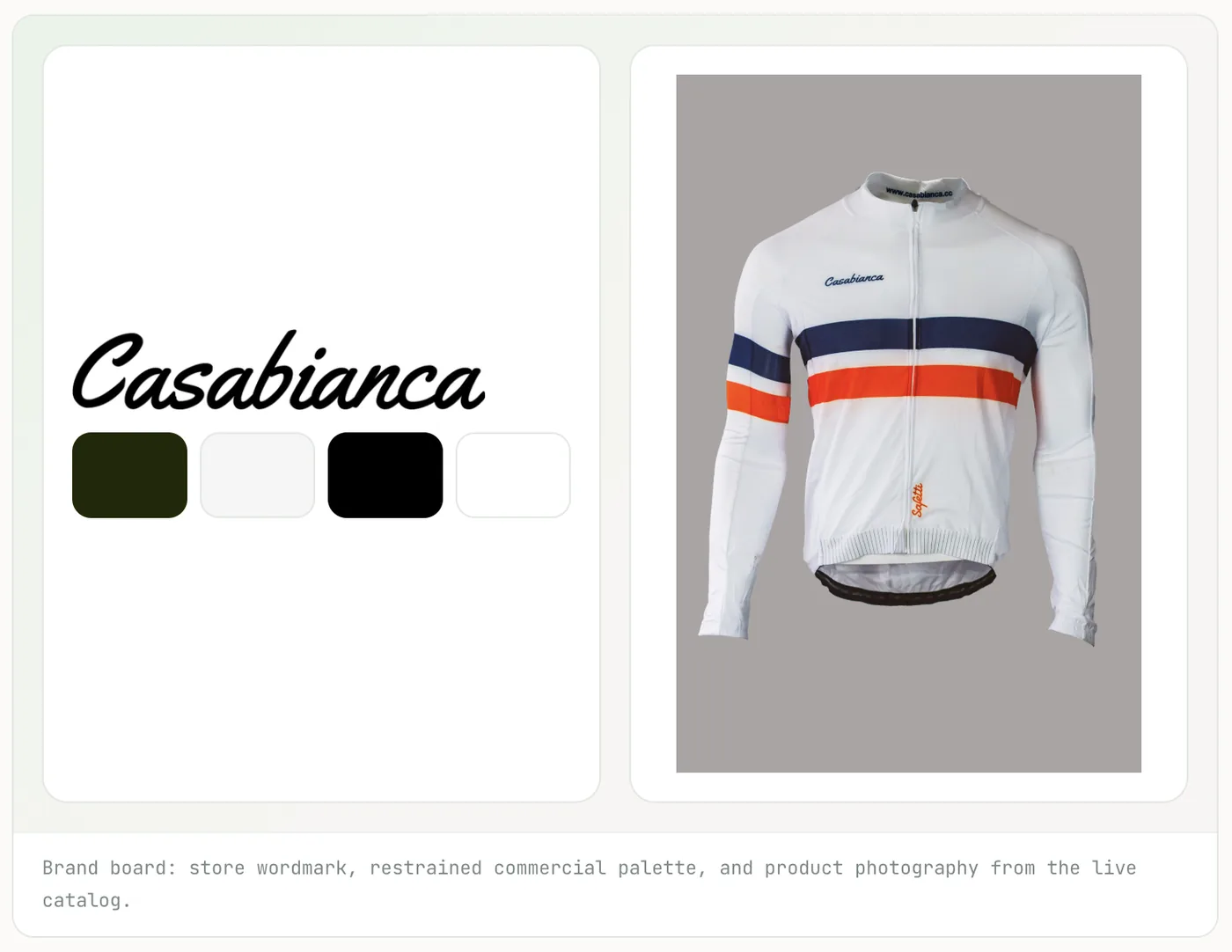
The givelo collaboration led with restrained product photography and the wordmark, so a co-branded drop never lost the brand's own voice.